Ballard Power Systems
Elevating the brand of a clean tech leader
Ballard established themselves as a global leader in hydrogen fuel cell technology, expanded into new markets, and gained widespread acceptance of their technology. Subsequently, their brand required an overhaul in order to reflect their new reality – as an innovator and at the forefront of the industry.
We took Ballard through our rebranding process, which included stakeholder interviews, a brand audit, competitor analysis and positioning. Before we even touched the visual identity, we had a strong strategy in place.
Industry
Scope of Work


Creating visual interest and hierarchy
Our challenge was to update the brand identity without losing its recognizable and valuable aspects. We refreshed the logo, keeping the blue square but replacing the outdated lightning bolts and typeface with custom typography. We integrated flexibility with various formats as well as a system for the product line logos.
Randy MacEwen
President and CEO - Ballard Power Systems

Composing a tagline with multi-layered meaning
The tagline “Here for life” says that they are here for the long haul. It also carries a secondary, equally important meaning: that Ballard’s environmentally sustainable solutions are here for the life of the planet and all the creatures that live on it.
Nicolas Pocard
Vice President Marketing & Strategic Partnerships - Ballard Power Systems

Monique Dunn
Manager Corporate Communications - Ballard Power System


Bring Ballard's brand to life
The new identity system features a fresh colour palette and dynamic gradient that represents a hydrogen fuel cell’s chemical reaction. The updated photography style guide includes delighted people in vehicles powered by Ballard technology for deep connection with their target audience.

Discover How We Elevated Ballard’s Digital Presence and Brand Impact
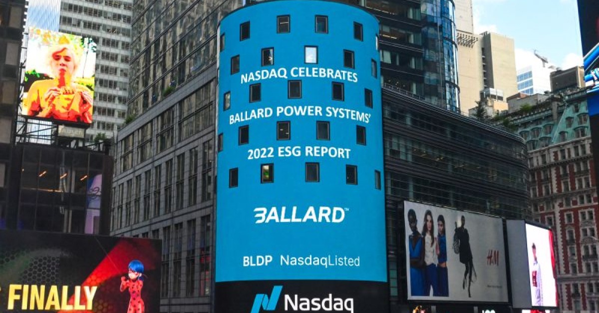
For a comprehensive look at the services we provided to Ballard, explore our case studies on UX/UI website design, where we enhanced user experience and functionality; the ESG report, which effectively communicates Ballard’s sustainability efforts and impact; and our marketing services, which drove engagement through strategic campaigns.
